Showing posts with label Planning. Show all posts
Showing posts with label Planning. Show all posts
Gym Scene Inspiration
Below is a video that we studied earlier in the year on genre conventions and analysis of videos - we used this as one of our inpirations for the gym scene because of the aerobiocs style but mostly we had an idea of what we wanted to achieve and this video generally gave a basis of how to do and how not to do it because it is almost grotesque in its dancing/performance, we didn't want this we wanted funny exercise with the band - just like in the rest of the video, its all fun.


Foley
The create our intro and outro we had to create foley. In the track above the first part is pen sounds as our original intro idea was Joe writing the song name and the name of the band on a piece of paper, this idea was scrapped however we kept the foley to refer to in our evaluation. Other foley in this clip includes knocking, folder slapping and shouting.
Digipack - CD Inspiration

I really like the simple aspect to CD designs, everyone in the class was doing pictures all over their CD's and i wanted our groups to be different, not just following the crowd of pictures on the CD because i know for a fact a lot of CD's within albums don't actually have pictures on them, instead they do just have the songs and the band names and maybe some logos of the band or a design of some sorts, rarely they are actually photos.
Digipack - Lyric Part Inspiration


Two albums that i own at home both have this scrippled, doodle-esk writing within their digipack booklets within them, i really liked this informal style to the booklets, breaking the mold of the regimented nature of the media.
I wanted it to be on our digipack to bring that informality of the group across also a design aspect that looks different form the average load of typography.
Label Generator
Below is the link to the website that generates the vintage labels that i used on my digipack to give off that vintage feel, that 70's older generation vibe, where everybody had a label maker.
We used these vintage labels across all of our media to have synergy across everything to do wth the band; the digipack, the website and in the video.
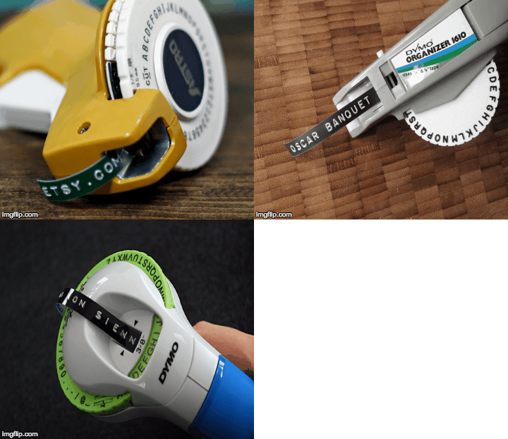
The website ::: http://imagegenerator.fuzzimo.com/embossedlabels/
Examples of Label's created for the digipack
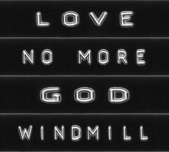
We used these vintage labels across all of our media to have synergy across everything to do wth the band; the digipack, the website and in the video.
The website ::: http://imagegenerator.fuzzimo.com/embossedlabels/
Examples of Label's created for the digipack
Front Cover Inspiration
Below is inspiration that i found for the front cover of the album/digipack, i was struggling to try and find the colourful creative feel of the band and replicate it onto the digipack design. I google searched images and found this Robin Thicke album cover.
It inspired my design because there are three images of him on the cover, our band contains three people and gave me the idea of how to present them behind the frontman, which is JK. And then my play on the colouring was to instead of just copying green and red colour of Robin Thickes cover, we decided to run with the colour of the hand prints on the bands faces rather than filter them completely through a colour.
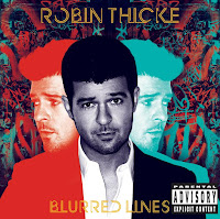
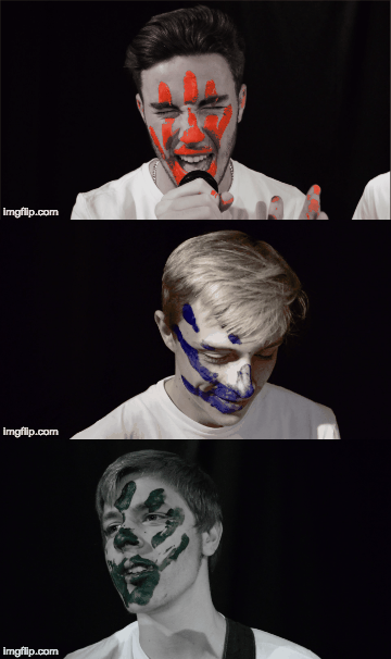
It inspired my design because there are three images of him on the cover, our band contains three people and gave me the idea of how to present them behind the frontman, which is JK. And then my play on the colouring was to instead of just copying green and red colour of Robin Thickes cover, we decided to run with the colour of the hand prints on the bands faces rather than filter them completely through a colour.

Intro & Outro Plannig
Below is a video of Wes Anderson shots from his plethora of films, where the camera angle is completely pointed downwards, a birds eye angle, of the desk or whatever is below.
This style of filming is something I really like because its so refreshing to the eye after seeing so much "normal" visual imagery and I think it would be really good to include in our video.
My thoughts are to use this as a filming style for an intro and outro to the video.
This style of filming is something I really like because its so refreshing to the eye after seeing so much "normal" visual imagery and I think it would be really good to include in our video.
My thoughts are to use this as a filming style for an intro and outro to the video.
Filler Shot/Pick Up Planning
Folder Hand Over
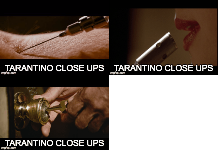
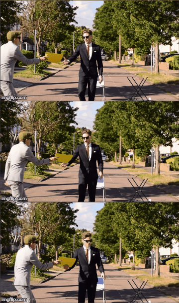
Below is a gif of the folder hand over shot that we want to reshoot, maybe as a close up, extreme close of hands connecting with the folder, kind of like Quentin Tarantino style, with his really close up cut away.
Have to make sure to get the action exactly the same ::: JK reaches out with his right hand and grabs folder from Harry who is passing it with his righthand.
Coffee Hand Over
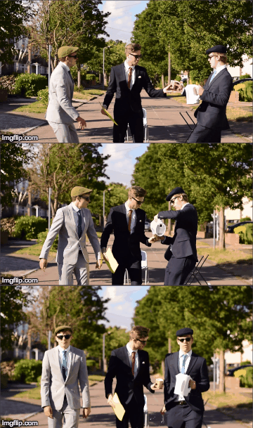
Oliver hands the Coffee cup to Jk with his right hand and pours coffee into the mug with his left. Should get a extreme close up of the coffee pouring and water turning to coffee in the cup.
Below is a gif of the folder hand over shot that we want to reshoot, maybe as a close up, extreme close of hands connecting with the folder, kind of like Quentin Tarantino style, with his really close up cut away.
Have to make sure to get the action exactly the same ::: JK reaches out with his right hand and grabs folder from Harry who is passing it with his righthand.
Coffee Hand Over
Oliver hands the Coffee cup to Jk with his right hand and pours coffee into the mug with his left. Should get a extreme close up of the coffee pouring and water turning to coffee in the cup.
Intro & Outro Planning
I had the idea to bring a loose narrative into the music video via an intro and outro clip. The narrative would be that a worker is daydreaming at his boring 9 to 5 job and a folder is slammed on his desk and he opens it and it has the band name and song inside "AVENUE - MONDAY MORNING" and then the rest of the video ensues and then at the end the video fades to black and fades out of black to the same scene but the worker opens the folder and it is just filled with the usual corporate paperwork.
Beginning shot :
Foley of the background noise of office environment.
Bird Eye View Top down shot from high angle, slightly in front of the workers head so the shot isn't taken up by the top of the head and instead just the hands and sleeves. Full frame is to be taken up by desk.
Office worker has hands clasped, twiddles his thumbs, taps the desk etc and then a yellow folder (to match the one in the video) is slammed on the desk.
Voice heard in background " Get me those spreadsheets by the end of the day!"
Worker opens folder and the first page is the band name and song title for the video, use label pictures for synergy across website and digipack.
Spin up for spin up transition into the rest of the music video.
End Shot :
Fade in from black.
Voice shouting in background amongst office environment foley "Joseph stop daydreaming".
Worker re-opens folder and it is filled of corporate paperwork.


Beginning shot :
Foley of the background noise of office environment.
Bird Eye View Top down shot from high angle, slightly in front of the workers head so the shot isn't taken up by the top of the head and instead just the hands and sleeves. Full frame is to be taken up by desk.
Office worker has hands clasped, twiddles his thumbs, taps the desk etc and then a yellow folder (to match the one in the video) is slammed on the desk.
Voice heard in background " Get me those spreadsheets by the end of the day!"
Worker opens folder and the first page is the band name and song title for the video, use label pictures for synergy across website and digipack.
Spin up for spin up transition into the rest of the music video.
End Shot :
Fade in from black.
Voice shouting in background amongst office environment foley "Joseph stop daydreaming".
Worker re-opens folder and it is filled of corporate paperwork.


Final Chorus Trail
In this post Olly has evaluated the editing technique we are considering to use in the final chorus of the music video. We had the idea of using different boxes and playing different footage in different boxes with the colours of the band in the spare boxes.
In the first box part olly felt the size of the main video for the section was too small so olly is going to make this bigger. In the third part the main box is a lot larger than in the first part and it looks a lot better.
Another aspect we might change is making the lines between each box white instead of black. This is because some of our footage has a black background and the lines aren't very clear.
In regards to the coloured boxes. Olly is thinking we could make a colourful animation of a moving pattern to put in these sections as they look too plain at the moment.
Our teacher feedback also suggested we put text into the video to line up with the lyrics especially in the coloured boxes.
Overall, we are going to use this idea however we are going to make some alterations.
In the first box part olly felt the size of the main video for the section was too small so olly is going to make this bigger. In the third part the main box is a lot larger than in the first part and it looks a lot better.
Another aspect we might change is making the lines between each box white instead of black. This is because some of our footage has a black background and the lines aren't very clear.
In regards to the coloured boxes. Olly is thinking we could make a colourful animation of a moving pattern to put in these sections as they look too plain at the moment.
Our teacher feedback also suggested we put text into the video to line up with the lyrics especially in the coloured boxes.
Overall, we are going to use this idea however we are going to make some alterations.
Magazine Cover - 1st Draft
 In this post Olly have placed an image of the first draft of our magazine cover along with the inspiration we used to create it. As you can see we added the logo in the same place along with the Oasis part at the top. Another aspect we looked at was highlighting the text in white and making the artist names taller than the other text.
We tested using a white background but it looked quite empty. We used inspiration from our music video of having the coloured smoke bombs in the background as it plays in big part in the video. In feedback we have received people say it makes theres eyes hurt with the mixed colours. However, we were happy with this as our first draft and we will take this feedback onboard when doing the next draft.

Location Scout 2
Below are some photographs from the seconed location recce where we will be filming our 'smoke bomb scene'. The first image is of the first location we looked at, we decided this location wouldn't work because there was too many trees and telegraph poles in the area. There was also a road which ran close by the field and as we were using smoke bombs we did not want to alarm any people driving past.
We found a nice secluded area which can be seen in the 2nd to 4th images. Our only query was which way to film. The images demonstrate the different possible areas.


We found a nice secluded area which can be seen in the 2nd to 4th images. Our only query was which way to film. The images demonstrate the different possible areas.


Subscribe to:
Posts (Atom)