
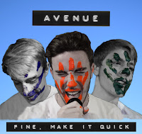
Final Digipack

This is the final digipack that i created for our band. Working from the feedback from the class I made the top and bottom half look like the same digigpack with a colour theme, not make the design of it all indie or dark (just my personal style coming through) and designing something that actually works for the bands image and brand.
For the background I used a still from the video of the blue sky hence the slight gradient of lighter blue to darker blue, this immediately gave the digipack an energy that it didn't have before and a more vibrant visual - just like the band has.
I then went on to use the bands colours across the whole digipack, something that we created early on within the project was for each man in the band to have their own colour representing them and that can spread across all the media for the band.

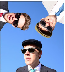
These colours are clearly displayed straight away as representing the individual members of the band on the front cover as the colour of their handprint faces is the only colour on them. This edit on the bandmates was done two different ways, Olly and JK's (right and centre) were done on Premiere Pro in the edit, using the video effect "Leave Colour" and then playing with the effect settings to find what worked for that frame. Harry (Left) was more difficult to get a clean distinguishing blue against grey, his skin colour still coming though in places I think because of lighting being different across the face. So what I did was duplicate the layer of the image on Photoshop and then turn one layer Black and White while the original image layer underneath remained in colour and then I used the "Background Eraser" tool, whilst the black and white layer was selected, to erase the black and white filter/layer on the hand print on the face to reveal the coloured handprint. I then merged the layers so I could select Harry's head and shoulders to copy him over to the front cover.

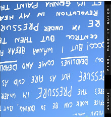
The colours of the band are also seen on the back cover with he song list where i used a paint tool on photoshop and changed the actual brush to something that was more flowing and drew on three different layers the colours of the band members and then continued the theme of using labels for the song names.
The colours of the band are also seen on the back cover with he song list where i used a paint tool on photoshop and changed the actual brush to something that was more flowing and drew on three different layers the colours of the band members and then continued the theme of using labels for the song names.
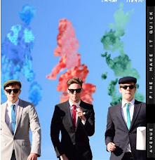
On one of the inside pockets Nathan displayed the bands colours again but this time with smoke from the smoke bomb scene. I cut out the band from the beginning scene and then Nathan cloned smoke onto new layers behind the band members.
For this section Nathan got Olly to write out lyrics to the Monday Morning song, Nathan imported the image, inserted a blank layer behind. I then proceeded to quick select each individual letter of the lyrics, then deleted what Nathan had selected leaving the white outline of the words and copied those over to the digipack section.
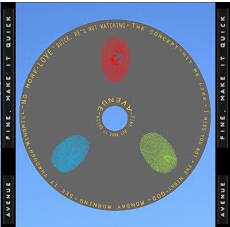
For the CD Nathan was told in feedback to make it more visual than just the grey disk with the songlist and band name on it so i imported colour thumbprints as pngs so they wouldn't have backgrounds and again showing the bands colours. I like the simple design to the CD and from my research this seems to be what real bands do most of the time with there CD design.
This last section is really simple and is just cut outs of the bands, using the quick selection tool and re arranging their positioning on the digipack.
For this section Nathan got Olly to write out lyrics to the Monday Morning song, Nathan imported the image, inserted a blank layer behind. I then proceeded to quick select each individual letter of the lyrics, then deleted what Nathan had selected leaving the white outline of the words and copied those over to the digipack section.
For the CD Nathan was told in feedback to make it more visual than just the grey disk with the songlist and band name on it so i imported colour thumbprints as pngs so they wouldn't have backgrounds and again showing the bands colours. I like the simple design to the CD and from my research this seems to be what real bands do most of the time with there CD design.
This last section is really simple and is just cut outs of the bands, using the quick selection tool and re arranging their positioning on the digipack.


Evaluation Question 4
What have you learnt from your audience feedback?
Our music video was aimed at all the teen ages and can range up to low 20's. We also showed people that where of a higher age range and most enjoyed to view out video. so there is a big range that it can appeal to. We found the range we aimed at was a classic pop and dance age range.also similar songs and artists have the same sort of age range.
Below is a presentation showing examples of our primary and secondary audience:
Near the end of November to start of December we finished our first draft of our music video and we got feedback on the viewing which helped us develop out music video further and move out the bad parts and add in new improved parts. We had a clear idea what we need to improve before our final piece was presented and finalised.
This is some of the feedback we received...
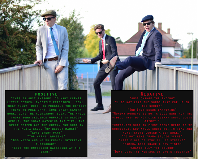
From this feedback we decided to make a few changes with the out of focus shot being replaced by the folder and coffee cup hitting the floor. We corrected the camera shaking by editing it on premier also the end shot was.
We also got feedback of ur digipack..Here is some of the feedback we got (hover over image then over the red and white circles).

We knew that we needed to change a few parts as the top and bottom do not look like they belong together.
This is our final digipack... as you can see it is a huge change from the first draft as we needed to create more synergy.


This is some feedback from fellow media students. The questioned i ask throughout are shown before the people answer them. We learned that some shots are not liked and feel out of place. For example the forest shots. A few people said that this could be changed.
Summary of what we learnt:
Our music video was aimed at all the teen ages and can range up to low 20's. We also showed people that where of a higher age range and most enjoyed to view out video. so there is a big range that it can appeal to. We found the range we aimed at was a classic pop and dance age range.also similar songs and artists have the same sort of age range.
Below is a presentation showing examples of our primary and secondary audience:
Near the end of November to start of December we finished our first draft of our music video and we got feedback on the viewing which helped us develop out music video further and move out the bad parts and add in new improved parts. We had a clear idea what we need to improve before our final piece was presented and finalised.
This is some of the feedback we received...

From this feedback we decided to make a few changes with the out of focus shot being replaced by the folder and coffee cup hitting the floor. We corrected the camera shaking by editing it on premier also the end shot was.
We also got feedback of ur digipack..Here is some of the feedback we got (hover over image then over the red and white circles).

We knew that we needed to change a few parts as the top and bottom do not look like they belong together.
This is our final digipack... as you can see it is a huge change from the first draft as we needed to create more synergy.

We also got a focus group to view our music video. Here it is...
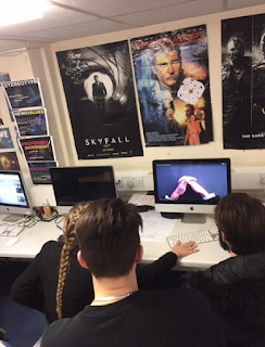
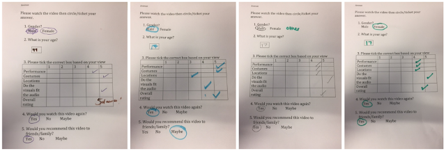
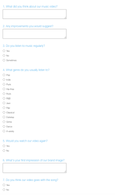
I created a questionnaire for people to answer after a screening. These are a few of the results and a few watching our video...
This is feedback from a ex GBHS media student who is now involved in the music industry...
Avenue - Monday Morning (Final) – A really clear beginning middle and end. A well thought out video with endearing performances from the band with great lip-sync and fun energy. The comedy was well balanced and the video continued to develop as new scenes played out, helping to drive the story through.
I also created a survey for people to give more detailed responses... I also sent it our to more people as it was easier to access them through email.
Here is the responses a collected...

I created a questionnaire for people to answer after a screening. These are a few of the results and a few watching our video...

This is feedback from a ex GBHS media student who is now involved in the music industry...
Avenue - Monday Morning (Final) – A really clear beginning middle and end. A well thought out video with endearing performances from the band with great lip-sync and fun energy. The comedy was well balanced and the video continued to develop as new scenes played out, helping to drive the story through.
I also created a survey for people to give more detailed responses... I also sent it our to more people as it was easier to access them through email.

Here is the responses a collected...

This is some feedback from fellow media students. The questioned i ask throughout are shown before the people answer them. We learned that some shots are not liked and feel out of place. For example the forest shots. A few people said that this could be changed.
Summary of what we learnt:
Gym Scene Inspiration
Below is a video that we studied earlier in the year on genre conventions and analysis of videos - we used this as one of our inpirations for the gym scene because of the aerobiocs style but mostly we had an idea of what we wanted to achieve and this video generally gave a basis of how to do and how not to do it because it is almost grotesque in its dancing/performance, we didn't want this we wanted funny exercise with the band - just like in the rest of the video, its all fun.


Foley
The create our intro and outro we had to create foley. In the track above the first part is pen sounds as our original intro idea was Joe writing the song name and the name of the band on a piece of paper, this idea was scrapped however we kept the foley to refer to in our evaluation. Other foley in this clip includes knocking, folder slapping and shouting.
Digipack - CD Inspiration

I really like the simple aspect to CD designs, everyone in the class was doing pictures all over their CD's and i wanted our groups to be different, not just following the crowd of pictures on the CD because i know for a fact a lot of CD's within albums don't actually have pictures on them, instead they do just have the songs and the band names and maybe some logos of the band or a design of some sorts, rarely they are actually photos.
Digipack - Lyric Part Inspiration


Two albums that i own at home both have this scrippled, doodle-esk writing within their digipack booklets within them, i really liked this informal style to the booklets, breaking the mold of the regimented nature of the media.
I wanted it to be on our digipack to bring that informality of the group across also a design aspect that looks different form the average load of typography.
Subscribe to:
Comments (Atom)