Label Generator
Below is the link to the website that generates the vintage labels that i used on my digipack to give off that vintage feel, that 70's older generation vibe, where everybody had a label maker.
We used these vintage labels across all of our media to have synergy across everything to do wth the band; the digipack, the website and in the video.
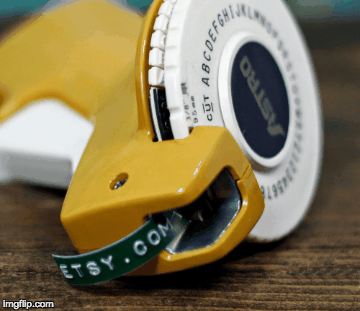
The website ::: http://imagegenerator.fuzzimo.com/embossedlabels/
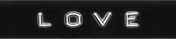
Examples of Label's created for the digipack
We used these vintage labels across all of our media to have synergy across everything to do wth the band; the digipack, the website and in the video.
The website ::: http://imagegenerator.fuzzimo.com/embossedlabels/
Examples of Label's created for the digipack
Front Cover Inspiration
Below is inspiration that i found for the front cover of the album/digipack, i was struggling to try and find the colourful creative feel of the band and replicate it onto the digipack design. I google searched images and found this Robin Thicke album cover.
It inspired my design because there are three images of him on the cover, our band contains three people and gave me the idea of how to present them behind the frontman, which is JK. And then my play on the colouring was to instead of just copying green and red colour of Robin Thickes cover, we decided to run with the colour of the hand prints on the bands faces rather than filter them completely through a colour.
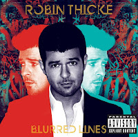

It inspired my design because there are three images of him on the cover, our band contains three people and gave me the idea of how to present them behind the frontman, which is JK. And then my play on the colouring was to instead of just copying green and red colour of Robin Thickes cover, we decided to run with the colour of the hand prints on the bands faces rather than filter them completely through a colour.

Intro & Outro Plannig
Below is a video of Wes Anderson shots from his plethora of films, where the camera angle is completely pointed downwards, a birds eye angle, of the desk or whatever is below.
This style of filming is something I really like because its so refreshing to the eye after seeing so much "normal" visual imagery and I think it would be really good to include in our video.
My thoughts are to use this as a filming style for an intro and outro to the video.
This style of filming is something I really like because its so refreshing to the eye after seeing so much "normal" visual imagery and I think it would be really good to include in our video.
My thoughts are to use this as a filming style for an intro and outro to the video.
Filler Shot/Pick Up Planning
Folder Hand Over
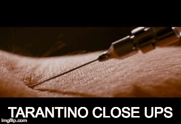
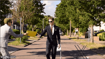
Below is a gif of the folder hand over shot that we want to reshoot, maybe as a close up, extreme close of hands connecting with the folder, kind of like Quentin Tarantino style, with his really close up cut away.
Have to make sure to get the action exactly the same ::: JK reaches out with his right hand and grabs folder from Harry who is passing it with his righthand.
Coffee Hand Over
Oliver hands the Coffee cup to Jk with his right hand and pours coffee into the mug with his left. Should get a extreme close up of the coffee pouring and water turning to coffee in the cup.
Intro & Outro Planning
I had the idea to bring a loose narrative into the music video via an intro and outro clip. The narrative would be that a worker is daydreaming at his boring 9 to 5 job and a folder is slammed on his desk and he opens it and it has the band name and song inside "AVENUE - MONDAY MORNING" and then the rest of the video ensues and then at the end the video fades to black and fades out of black to the same scene but the worker opens the folder and it is just filled with the usual corporate paperwork.
Beginning shot :
Foley of the background noise of office environment.
Bird Eye View Top down shot from high angle, slightly in front of the workers head so the shot isn't taken up by the top of the head and instead just the hands and sleeves. Full frame is to be taken up by desk.
Office worker has hands clasped, twiddles his thumbs, taps the desk etc and then a yellow folder (to match the one in the video) is slammed on the desk.
Voice heard in background " Get me those spreadsheets by the end of the day!"
Worker opens folder and the first page is the band name and song title for the video, use label pictures for synergy across website and digipack.
Spin up for spin up transition into the rest of the music video.
End Shot :
Fade in from black.
Voice shouting in background amongst office environment foley "Joseph stop daydreaming".
Worker re-opens folder and it is filled of corporate paperwork.


Poster Development
This is the first poster i came up with. The image was really clean and it felt like we was walking out of the poster. You could clearly see all three members with Jk at the front as he is the main artist. All the information i needed could be put around us so none of the writing would cover us. Secondly the title was bold and the dates were clear.


I had the idea of using the bridge shot however we looked a but fuzzy as we was quite far away. I used this text as it links to our digi pack. The tour dates are difficult the read on the plants therefore this idea couldn't be used. The date need to be clear and displayed well. The shot does look nice and is in our video again.

The 4th idea i had was using a shot down the avenue as this was our first scene. furthermore i used the smoke bomb and cloned this in as Nathan was going to use this on 8r digipack. This gave me nice space to write all the dates and the title. The concrete make a nice space for the tour title to go and it stood out. However we decided the smoke didn't work on the digi pack or poster so we did not use this in the end.

As the colours made it hard to read the text due to all the colour we had the idea of putting in a block colour background so the dates could be displayed. Also we added in the smoke still around the edged to create the synergy needed. This text was more formal and bold however this didn't match our theme through website and digipack.


This was my second ides of using us in the play ground but there was not that much space for text so I cloned the pavement more but this looked out of place. I like there quality of this photo and we all looked the same. Its is in our music video therefore people wold know the link.


Former Student / Student Feedback
Avenue first draft: love the way the background is out of focus at the start and at 40 seconds when there’s blurry grass in the foreground! good quality footage makes a big difference! the ending is great, it really builds up into that finale. when the words appear, i think it might look better if they were in the same split box effect with the black border as 2:36 and 2:40 instead of just overlaid? I feel like when the words come up at an angle it looks a bit unprofessional and less bold than if it was in the same effect as the other clips or even if it was just all bold across the centre of the shot like “head” and “paint”. really fun to watch! really original!
Avenue:
Avenue:
Monday morning is noit a good name for the videoDo not like drmaa
Avenue: We got full top mark ticks from this student. Also the student said editing is amazing and is simple but makes the video. End shot needs improving.
Avenue: We got top mark ticks. Level four they stated. Also again they said end shot is needed to be changed and one or twos shots throughout.
Avenue: Top mark ticks, level 4, Amazing.
Avenue: They said monday morning isn't a good name for our video. They liked the walking shots. They didn't like the subway background as it looked grimey. Also close-ups looked excellent. The split screen they were torn on.
Avenue: The unfocused shot on the first scene needs to be corrected. Low angle shots were not in time. Walk through forest needed to be sped up. They also said they were a bit dull. Jk jumped a little higher after smoke bomb scene.
Avenue: Good video and holds enough interest throughout.
Avenue: just change ending.
Avenue: 1st alley shot is not good quality, level 4. 'Mad effects' and fluent theme.
Avenue: Out of focus first shot. The editing they liked. Don't like the subway shot. Don't understand walking through forest shot. They liked the colours of the playground and the theme red, green and blue. Don't like the drama studio shots. Don't like the ending shot. Could have birds eye view shot.
Avenue: Love every part. little out of sync in science room.
Avenue: Change colour of Ollys tie.
Avenue: Love the colour theme. The idea of the photo shot transition just needs reshooting.
Avenue: Don't like montage of shots together. i love all other shots especially powder paint.
Avenue: Don't get walking through forest. Camera shakes sometimes. 37/40
Avenue: Don't like parts with words.
Avenue: LOVE, LOVE, LOVE. the forest scene doesn't fit. The unfocused first shot looks out of place.
Avenue: Pretty flawless. Camera does shake on occasions and a couple shots loom a bit false/out of place.
Avenue: Like correlation with paint and lyrics. Transitions are cool. Favourite is 360 degree shot. Some shots unsteady, not sure about text over faces.
Avenue: This is so good. The colours are really vibrant and is enjoyable. The beginning shot goes out of focus and at times the camera shakes and moves too quickly.
Digipack Feedback From Peers
Avenue – the images of all the band at the top looks really good with the text over their faces. The background for the bottom images looks good and works with the bands image. 8
Avenue
· Like the colour clouds
· Don’t understand the CD
· Coloured hands on faces look good
· Don’t get the song name
· Don’t get all the writing over the faces
Avenue
The front cover is appealing straight away and the photo is really good. I don’t think the powder background really matches the digipack. The text on the back with the songs is a bit difficult to see and the font doesn’t really match the other font on there. The writing across their faces are cool but it means you can’t see the faces of the artists but the colours look good with the black and white. There is not much consistency with the colour scheme. I don’t think the spines match either. really nice as it is bright and eye catching. Although along with it being unfinished, on the back cover he titles of the songs can be a bit difficult to read, and maybe need to be made bolder.
2/10
Avenue
I like the idea that you have with the smoke that goes around the edges. I also like the vibrancy and brightness that you have throughout the photos.
To improve the Digipack though I would make the top of Digipack match the bottom better meaning it isn’t as consistent as it could be. Also where the lyrics go over the top of the spines you can’t see part of the words, so maybe change the background images. 7/10
Avenue
Really like the images, looks highly professional. It is very confusing for the eyes, as there is a lot going on – but is that to match with the music video? I like how each artist represents a different colour, however I don’t like the blue and pink background, as I think it looks a bit random. Overall, however, looks very good and professional. (Level 3)
Avenue
I like the top three pictures where it is the boys where the lyrics cover their faces as I like the black and white and then the pop of colour on their faces. I think there is a big difference between the top row of photos and the bottom row of faces and it looks quite messy. I like the front cover but personally don’t really like the background you have used on the bottom row of photos. I think the text on the list of songs on the album should maybe be in a bolder colour so that it stands out more. I think the colour of the cd which is grey doesn’t go with the theme of the digipack or the yellow writing on the CD. The yellow writing on the CD should maybe be changed to either red, blue or green so that it matches with the rest of the digipack.
AVENUE – Really like the 3 pictures of the guys in top however it makes it confusing with all the writing over their faces. Other than that I think it is really great as it highlights their synergy and how the guys are really like. LEVEL 3
Avenue
The 3 photos of the band are effective because it means we instantly know that they are ‘all together as one’. Furthermore, the image in the bottom corner is humours which portrays the bands image effectively. However, I feel the font on the front cover of the digipack could be massively improved and really undermines the creativity.
Avenue- I love this digipak, it all matches well and the colours blend well with each other. To improve the CD could have a bit more design on it.
Avenue:
Needs arranging properly but the design is good however the picture for the back cover needs moving. 7
Website Feedback From Peers
Maybe with the tour dates, it could take you to a different page instead of an anchor point. This could look really cool because you could have your tour poster in the background. Maybe this will sell the tour much better, offering a link which takes you where you can go straight to buying the tickets. This will also bulk up the website even more.
The bio page doesn’t have very detailed information on and is a bit too short. The tour section is too small and plain and boring. Really like the music page. Overall I think the colour scheme for the website is good and matches the theme of the video. Ella O
Don’t like the music that plays automatically you have to scroll down to stop it. Shouldn’t be on an automatic loop. Don’t like the red writing but it is bold and does stand out. Opening photo is really nice and shows the group well. The text should be a bit bigger as can’t really see it properly but the font is good with the theme. The photos look really professional and there is lots of information which is interactive. Does look like a very professional website.
Good screen as you open up the site. The buttons at the top look a bit too basic and could be improved. Actually make a full bio instead of having a button but nothing comes up when you click on it. Tour dates look good. Who are we? Basic info? About us? Too much, no one is going to read all of that. Clothing Read more??? Change. Nice merch
Good screen as you open up the site. The buttons at the top look a bit too basic and could be improved. Actually make a full bio instead of having a button but nothing comes up when you click on it. Tour dates look good. Who are we? Basic info? About us? Too much, no one is going to read all of that. Clothing Read more??? Change. Nice merch
give me a pallete ima paint this town red.
The website is bright, vibrant and excited which is really nice to look at. The photos used are clear and all the links work well. I also like the page for the merchandise and the fact that you can buy tickets on it too. It is REALLY ANNOYING that the song plays every time you go on the home page and there is a slight inconsistency in the fonts used throughout and at times I think there is too much text on a single page. Level 3- 7/10
The website is bright, vibrant and excited which is really nice to look at. The photos used are clear and all the links work well. I also like the page for the merchandise and the fact that you can buy tickets on it too. It is REALLY ANNOYING that the song plays every time you go on the home page and there is a slight inconsistency in the fonts used throughout and at times I think there is too much text on a single page. Level 3- 7/10
I like the cartoons of each member – makes it fun Header image showcases image of band – colourful etc. Merch page looks professional but they have individual buttons but it leads to the same page Don’t like the red text on Header About Us is too long – maybe break into paragraphs Why is Tour Date on right side Every page should be individual instead of just being on one page Level 4 – 9 By Angel
7, - Quite bland and limited, Heard the song too many times before, don’t need to instantly hear it again, Like the background and the quality of photos
7- The music playing is a good touch and makes the website unique, becomes a little annoying after a while, Tour dates are really good and work well and The about page is very good and detailed.
like the colours, dont like shape of buttons at top, not much on who are we section, dont like the music playing when you go on website, dont understand the tiger and theres not much merchandise. 6/10
8 - The front page looks really good and with the little cartoon characters. The font works really well with the band. On the gallery maybe don’t make it auto play? Really good website with some minor changes, at the bottom just remove the youtube icon. By Charlie
I absolutely love the little images of the avenue boys as it makes it playful and fun. All the images are fun and high quality. I don’t know if the basic info section is needed, it seems a bit irrelevant and like a Wikipedia page which doesn’t fit with the rest of the website. On the merchandise you either need to delete the product description section or write a description as it is just the default setting at the moment as well as the refunds/shipping policy. I really enjoyed this website however maybe make the pages separate so less scrolling. 9/10. Clare
The full bio doesn’t load up. I like the mini characters at the top. Not sure if you need to basic info box as the description and about us already explains that. I like how things pop up as you scroll down the website. I like how everything is really high quality and professional looking. Id mark this website a 9.
love the design and layout of the website - suits the genre of the artist, feels like a happy website. Gallery video is unique with the song is also a good use of syngery. Good use of infrmation on the website, not boring. High Level 3
I like the bitmojis at the bottom of some of the articles and the way that the song plays when you open up the website. A couple of the pictures looks a little bit out of focus. Level 3
"download full bio" needs to be linked, digipak cover looks quirky which fits artist, colours are good and bold, think there should also be a gallery where you can navigate through pictures instead of a video, I like the ticketmaster banner, "tickets", "clothing" and "album" links need to go to the right places. - 7/10 Level 3
Can't even fault your website which is extremely annoying ( Level 4) Love the whole colour schemes and pages, clearly represent the artists image and i also love the photo album, looks very professional
Level 3 - Loveeeeee it, it's really fun and colourful! Great synergy. Some pictures in the collage are blurry
My Digipack Feedback For Other Groups
ANNIKA – Think the title of the album could be displayed
better. I like the text used. Think the artists name is too big. Nice clean
photos. Name cut out on bottom corner.
MYA – Love all the photos they are really nice, especially
the bottom right with MYA and parental advisory on it. The colour scheme is
well matched. I like the CD cover. Think the song names could be put in
capitals as well to match your artists name and numbered or spaced out more so
it doesn’t look like a paragraph. Logo down the spine.
TORI LORENTE – Photos match well. The song list starts to go
useable towards the brightness of the flash. Think the photos on the chair
could be better, look pretty basic.
IVORY – photos are really clean and nice and match well.
Don’t really like the message page. Logo is used well throughout. CD cover
looks really nice. Good text used and it is clear.
IURIS – The words around the photos are really nice and
match throughout. Think the effect on the CD cover could be used again. Really
good front cover. Like the font used. I like the alternate black and white
boxes. Think the cable tower could be edited out of the mirror and song list
could be put in a getter place. Some parts a little hard to read.
SEMPA – Name? Logo? Album name? Is the keep clear the album
name or just there looks a bit out of place. Think there are a bit too many
ideas put into one. The bottom left is 1 idea then the blurred photos are
another. Then normal photos another idea. All photos are good however. Just
need to display them differently.
AVA – I really like the front cover in red. The album names
are really good but I think the ‘love you’ should be on the same line. The camo
colour is nice. The blurriness running throughout is good. The keys look
clearly edited in this could be changed. Is there an album name? The yellow front cover isn’t as
good. If you want the yellow them can you do the same as the red with yellow? I
like the bottom left, text is nice.
Could be yellow background with white hearts. Bottom right looks a bit
out of place.
LUELLA – God theme of red throughout. Words are a bit hard
to read on the bottom left and song list. Think name could be put on front
cover. Nice use of red smoke on CD. Good clean photos used. Think white
backgrounds should be changed to black, as this will match the whole digi pack
more.
STELLATO - Good photos. Think the text is a bit basic. 2 of
the same photos just in different colour? Think CD cover could be better and
match the rest of the digipack better.
HEIDI – do not like the photo of the legs. Look out of place
and random. Cd cover is nice and matches all the colours. Like how the song
lists is displayed but don’t like the arm in the photo. Also I think all of
them should be white dots or all the purple boxes. Nice front cover. Don’t like
the information page. Words hard to read on top right. All of them should be
based around looking like a stamp or 1.

Subscribe to:
Comments (Atom)